Mobile friendly WordPress Themes


Best Mobile-Friendly WordPress Themes: Build a Responsive Online Presence
Want to give your website a complete makeover and not break a sweat? Here is MonsterONE's brilliant portfolio of mobile-friendly WordPress themes. No matter whether you are the next blogging superstar, a budding entrepreneur, or a grizzled seasoned pro, these templates are the top picks for making your site stand out on any screen. So tighten your belts and get ready to dive into a world of clean designs and smooth responsiveness that'll make your internet presence stand out. Let's roll!
Why Choose a Mobile-Friendly WordPress Template?
Think about it: isn't almost everyone glued to their phones these days? This means if your site is all wonky or takes longer to load on a phone than it takes to, people will leave faster than you can say, oops.
A mobile-ready template will have your webpage looking sharp on anything from a huge desktop monitor to a teeny-tiny phone screen. It's all about that user experience: navigation is easy, and content size is just right, not like a madman jumping in and out.
Google is all about mobile-friendliness too. Sites that play nicely on phones are what search engines love, which equals a higher ranking in SERPs.
In short, a smartphone-friendly site isn't just a fad; it's a wise strategy. It will make your visitors happy, your Internet image brilliant, and Google smile at you. In other words, why be satisfied with anything less?
Who Benefits from the Best WordPress Theme with Mobile-Friendly Design?
For all the hustlers in various fields, this pick will prove to be a godsend.
IT & Computers
Geeks and techies can rest easy in the knowledge that their sites look good and function properly on all devices. No more squinting or awkward scrolling to gain access to information—it's all there, clear as crystal, and user-friendly.
Finance
Money experts and financial wizards can now contact clients on the go to buy and sell stocks, invest their money, and even apply for loans. All from their cell phones.
Entertainment
For movie buffs looking for showtimes or music lovers cruising concert tickets, the mobile-first pages make certain that fanatics get the latest scoop with ease, all from their little pocket devices.
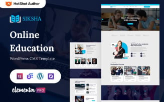
Education
Think about getting educational resources, course materials, and even tests and quizzes easily on your handset. No longer any excuses for being unable to get educational resources.
Sports
With sports game schedules, live updates, and player statistics, these templates bring the sports world right to your fingertips. It's like having a stadium in your pocket, or at least in your hand (well, almost).
Real Estate & Construction
Realtors and construction peeps can show off properties or building projects to their hearts' content on smartphones. This lets potential buyers or clients browse listings or examine blueprints while on the road.
Nonprofit
So can churches and charitable organizations. Events, donations, and volunteer opportunities are just a couple of clicks away. A simple tap allows more and more people to become involved and support the cause.
Features of a Mobile-Friendly Theme for WordPress
- First off, they're super responsive. This means they don't just appear nice on a computer; they adapt themselves to suit your smartphone or any other tiny screen. No strange zooming in and out to read things, just sailing along smoothly.
- Next up, blogs! It is very easy to set up a cool blog section where you can share your thoughts, stories, whatever. It's similar to keeping your very own online diary but with an audience
- Do you want to shout out some cool places or tell people where your shop is? These themes usually include integration with Google Maps. It means you can stick a pin on the map and tell the whole world where you are.
- Drop-down menus are hidden passages on your website. They keep things neat and orderly. You click or hover, and bam! A plethora of options appear neatly and maintain your site's clean look.
- And galleries. Display your work or photos, like your personal art gallery or photo album, right on your webpage. In other words, give people the chance to swipe through and admire your work.
- Now's the interesting part—drag-n-drop content. It is as simple as dragging things around on the screen. Do you want a picture here? Drag it. Want some text there? Drag it as well. Imagine playing with digital Legos, but you are constructing your website.
- Bootstrap is the skeleton of these layouts. It's a neat mix of gridded blocks that makes everything responsive and slick.
- Finally, there are portfolios. Now is your chance to shine. Show off your talents, your projects, or anything at all. Here is your opportunity to show off your skills and let visitors know all about you.
Choosing a Mobile-Friendly WordPress Layout
Finding a mobile-friendly WordPress theme at MonsterONE is a cinch. Here's the lowdown:
- Pick a Plan: First off, MonsterONE offers subscription plans that work with WP templates, including the All-in-One and All-in-One Lifetime plans. There are also many choices at no charge.
- Demo Time: MonsterONE offers demos. Just try them in phone mode or resize your browser window. Check if it is easy to navigate. Does it look slick? That's the stuff you're after.
- Check Ratings: Other users are your best friends here. Have a look at rankings by people who've used the product. They'll tell you how it's doing on smartphones.
- Filtering: Go into the left-side MonsterONE dashboard and filter items by topics, page builders, WP version, and plugin compatibility. After that, you'll be afforded a bevy of choices tailored to your style and content.
So go ahead and find that tablet-tailored gem. From there, your pages will shine all the more!
How to Use Mobile-Friendly WordPress Themes
When you find one you like, here's what to do:
- In your dashboard, go to "Appearance," then "Themes," and select "Add New." Upload the template, and click on Activate once it's installed.
- After that, in the "Appearance" section, click on "Customize." Here you can change colors, fonts, arrangements, and other things.
- This step is crucial! See how your site appears and functions on various mobile devices to be sure everything is smooth. Moreover, look for readability, easy navigation, and whether all your stuff appears okay.
- Sometimes some plugins or large images will affect responsiveness. Update all your plugins and optimize your images for quick loading on smartphones.
- Updates are common for CMS and plugins. To maintain mobile friendliness and security, make sure you update them regularly.
A How-to Guide for Building a Website for Your Company
Want to give your small biz a big online kick? This video's got your back with this quick and easy guide to designing your awesome WordPress-powered website. We'll take you from beginning to end, so you'll end up with an awesome online presence that will boost your sales tenfold!
Mobile-Friendly WordPress Themes: Questions and Answers
They look good and run smoothly on smartphones and tablets. Because layouts instantly adjust and resize elements, your page will be clear on any device.
There are various subscription plans—monthly, annual, and even a lifetime option—to be had in the marketplace. Great value for money: With a one-time payment, you can enjoy a treasure trove of thousands of state-of-the-art designs and multiply your efficiency in producing advertising materials.
MonsterONE provides installation services, so you don't have to pull your hair over FTP or learn tech jargon. Experts will make a template run smoothly for you.
Other services provided include All-in-One Website, Classic Website Customization, Logo Creation, Web Copywriting, etc.
| Product Name | Downloads | Price for One Members |
|---|---|---|
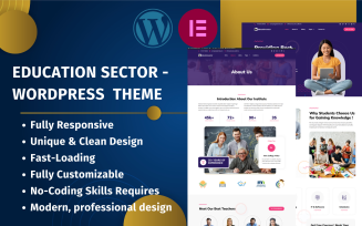
| Education Sector - Free Educational WordPress Theme | 1163 | Free |
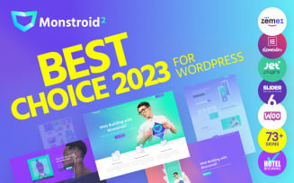
| Monstroid2 - Multipurpose Modular WordPress Elementor Theme | 14322 | Free |
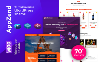
| Appzend - Multipurpose Business WordPress Themes Free | 1722 | Free |
| FREE Clean Medical Theme for Clinics, Doctors, Medical Offices, and Healthcare Professionals | 614 | Free |
| Educenter - Education Free WordPress Themes | 1127 | Free |
The All-in-One Membership
Get top-notch themes, high-quality extensions and professional support in MonsterONE
Join Now