A Latter Logo Concept for Creative Business Logo Template

A Latter Logo Concept for Creative Business
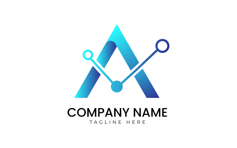
Logo Concept: The logo for A Latter embodies the essence of personalization, elegance, and sophistication. It seamlessly integrates elements that evoke the tactile experience of handwritten correspondence while maintaining a modern appeal.
Symbolism: At the heart of the logo is a stylized quill pen delicately poised to write, symbolizing craftsmanship, creativity, and the art of communication. The quill, rendered with flowing lines, evokes a sense of movement and fluidity, suggesting the seamless flow of ideas and expression. It also pays homage to traditional methods of writing, adding a nostalgic charm to the brand identity.
Typography: The typography is refined yet approachable, reflecting the company's commitment to quality and personalization. The lettering for "A Latter" is custom-designed, featuring elegant, flowing strokes that mimic the graceful curves of handwritten script. The use of a serif font adds a touch of sophistication and timelessness, while subtle variations in letter spacing enhance readability and visual balance.
Color Palette: A soft, muted color palette is employed to evoke a sense of warmth, refinement, and authenticity. The primary color is a rich, deep navy blue, symbolizing trust, professionalism, and depth. Complemented by accents of gold, representing luxury, elegance, and prestige, the color scheme exudes sophistication and timeless appeal. These colors also resonate with the classic aesthetic associated with handwritten correspondence and premium stationery.
Composition: The composition of the logo is balanced and harmonious, with each element thoughtfully integrated to create a cohesive visual identity. The quill pen is positioned elegantly above the company name, its tip poised as if in the act of writing. This placement draws attention to the central symbol while ensuring that the brand name remains the focal point. The overall design is clean, minimalist, and easily recognizable, making it versatile across various applications and platforms.
Versatility: The logo design is versatile and adaptable, suitable for use across a wide range of applications, including stationery, packaging, digital platforms, and promotional materials. Whether embossed on premium paper or displayed on a digital interface, the logo retains its integrity and impact, reinforcing the brand's identity and values consistently.
Conclusion: In summary, the logo for A Latter encapsulates the company's commitment to craftsmanship, personalization, and timeless elegance. Through its distinctive symbolism, typography, color palette, composition, and versatility, the logo establishes a strong and memorable brand presence that resonates with customers and communicates the essence of A Latter's unique offerings. It serves as a visual hallmark of quality, sophistication, and individuality, setting the company apart in the competitive market of stationary and personalized gifts.

